

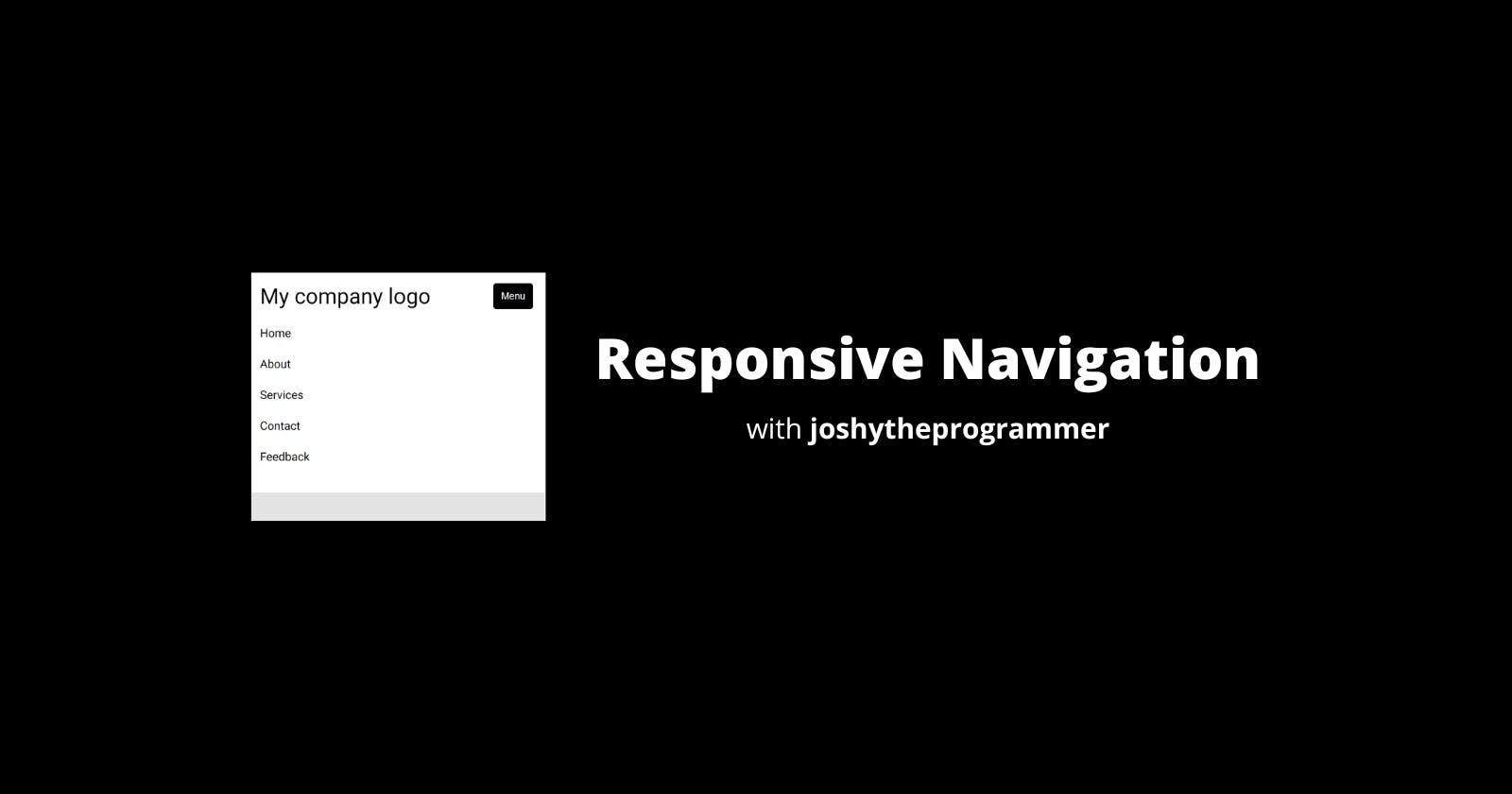
How to build a responsive navigation bar using just HTML and CSS.
In this short blog post, I will walk you through building a responsive navigation bar with html and css.


In this blog post here, I built a navigation bar. The problem with the navigation bar is that it wasn't responsive - meaning, it doesn't look good on mobile. It is important to build mobile-first. So I will walk you through building a responsive navigation bar right now. As always, you can find the code here.
Mobile First
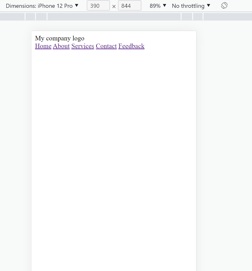
Mobile first is exactly as it sounds, instead of building from desktop to mobile, try building from mobile to desktop. Build for mobile and then scale up to desktop. To do that, open your browser dev tools, and set your dimensions to iPhone 12 pro. See mine:
Now let's add the basic HTML and CSS:-
<!DOCTYPE  html>
<html  lang="en">
<head>
<meta  charset="UTF-8">
<meta  http-equiv="X-UA-Compatible"  content="IE=edge">
<meta  name="viewport"  content="width=device-width, initial-scale=1.0">
<link  rel="stylesheet"  href="style.css">
<title>Responsive Navbar</title>
</head>
<body>
    <nav>
        <div class="header">
            <label class="logo">My company logo</label>
            <button>Menu</button>
        </div>
        <div class="nav-links">
            <a href="#">Home</a>
            <a href="#">About</a>
            <a href="#">Services</a>
            <a href="#">Contact</a>
            <a href="#">Feedback</a>
        </div>
    </nav>
</body>
</html>
The code is very basic, and it is similar to that of the former post linked above. There is just one minor change, the existence of the button under the label. Here is how the code looks,

You notice that the button doesn't show up. This is because of the following CSS:
@import  url('https://fonts.googleapis.com/css2?family=Roboto:wght@300;400;500&display=swap');

* {
    margin: 0;
    padding: 0;
    box-sizing: border-box;
}

html {
    font-family: 'Roboto', Verdana, Georgia, 'Times New Roman', Times, serif;
}

body {
    background-color: #E4E3E3;
}

nav {
    display: flex;
    justify-content: space-between;
    align-items: center;
    background-color: #FFF;
    padding: 1rem;
}

nav  .header {
    display: flex;
    justify-content: space-between;
}

nav  .header  label {
    font-size: 30px;
    font-weight: 400;
}

nav  .header  button {
    display: none; // this css here
    width: 55px;
    background: #000;
    cursor: pointer;
    color: #FFF;
    border: none;
    border-radius: 4px;
}
nav  .nav-links  a{
    text-decoration: none;
    color: #000;
    padding: 0  8px;
}

nav  .nav-links  a:hover {
    text-decoration: underline;
    text-underline-offset: 8px;
}
The display property is set to hidden. This is important.
media queries
You will notice that I have violated the principle taught earlier, this is for the sake of convenience. I want to make it easier for you to understand that's why I didn't work mobile-first. In your case, however, try doing this from the bottom up. So whatever is in this section, will be in your desktop section. That's just a head's up.
To make this code responsive, all we would have to do is introduce CSS media queries, that's all. In short, media queries make it possible to define specific rules based on the user's screen size.
@media screen and (max-width: 728px) {
    nav {
        display: block;
    }

    nav  .header  button {
        display: block;
    }

    nav  .nav-links {
        padding: 12px  0;
        display: none;
    }

    nav  .nav-links.active {
        display: block;
    }

    nav  .nav-links  a {
        display: block;
        padding: 12px  0;
    }
}
After defining these rules, our site looks something like

Now, add or remove the active class to see how it looks on desktop or mobile.
Note:- Typically, you would want the menu button to toggle the menu. This can be achieved through JavaScript. We will look at that in another post. Hope you enjoy it.